aCalendar Android Review
aCalendar is an Android app replacement for the standard Google calendar app and any others that are installed by the phone or tablet OEM manufacturer. It will mirror events added to the Google Calendar and update GCal when new changes are made to the calendar inside the aCalendar app.
The beauty of this app is the color scheme used which brings each calendar to life and makes it a pleasure to interact with. It is also very quick and simple to use. Much thought has gone into making it fast and self-explanatory.
Main Interface
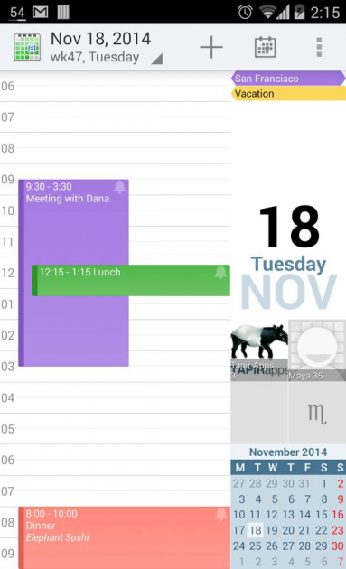
The main calendar interface shows the app icon, the current month, week or day (depending on the current calendar view – see below for more), a + symbol to add a new event, and a calendar icon.
Both the app icon and the calendar icon bring the user back to today's date and adjusts the calendar view accordingly.
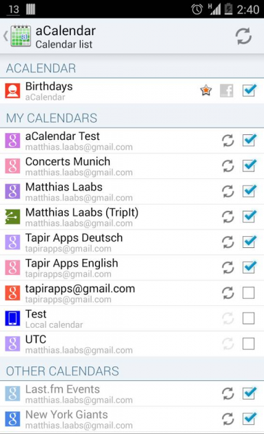
Tapping the Month, Date or Day bring up a complete list of possible event inclusions to the calendar. These include the device's Birthdays and Calendar list, Birthdays noted in a Gmail account, My calendar from different connected Gmail accounts, various contacts from Gmail, and Facebook friend birthdays and events too. These can all be toggled on/off depending what you wish to include in your aCalendar.
Calendar Views
There are many calendar views and these can be swiped between rather than having to fiddle with the settings somewhere to make the change.
A one month view is shown. Swipe right to left and this brings up the weekly view, and swipe again and you get the daily view. This kind of flexibility makes it easier to take a more global monthly snapshot of upcoming events, but then quickly see the fine detail on a specific day too. Nicely done.
Scrolling from the bottom of the screen upwards will reveal the next month, next week or next day depending on the current view selected.
Calendar Events
Events are shown on the calendar in a pale blue font which is difficult to read at time. This is for events with a time specified. For events that run all day they receive a darker blue background and black text which makes them far easier to see and read. This reviewer therefore tended to set each event as an all day one (even though they weren't which was less than ideal) in order to be able to see his own calendar events clearly.
There are different color schemes to choose from but tinkering with these didn't seem to fix this issue.
Adding New Events
Tapping the + symbol at the top toolbar will bring up a new event screen.
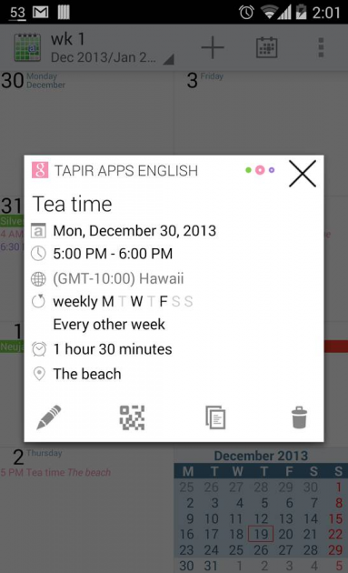
It is an easy matter to add a new dated event, specify a location and description for it, decide if it will be a repeating event, and then add an alarm, pop up, SMS message or email reminder all configurable for different time durations.
New events are easy to create and add to your Calendar. They are then synced to your Google calendar as well.
Widget
There is a home screen widget which can display your calendar and provide easy access to upcoming events without even needing to load up the app itself.
Video Preview
Verdict
aCalendar competes with Google's own calendar app, what the OEM hardware provide has installed for you and other apps like Any.do Calendar. The app stands up very well on its own, works seamlessly with Google Calendar records, Gmail records and Facebook information to add whatever you want to include to your calendar while leaving out the bits you don't. It is also very fast and colorful making it a pleasure to use.


